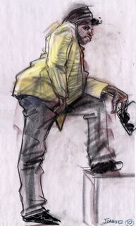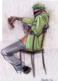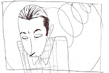


 I felt like posting some of my lifedrawing, since we have a portfolio due around this time. Recently ive been playing around with my linework and starting to dabble into colour. I checked out a really great Schiele exhibit when I visited NY in december. One room had 20 or 30 works that he had done right after leaving art school, and it was just a really great experience to see them in person. I wanted to mention Gerry Zeldin(my third year life drawing instructor) as well, who manages to create a great class environment where the students that take part are encouraged to grow and develop as artists. He has been hands down one of the best instructors I've ever had at Sheridan college, and Im sure that many other Sheridan Animation Alumni who were taught by Gerry can attest to the same thing.


20 comments:
Wat can I say but WOW! Sorry if I sound like a fan boy but I gotta tell you Ivee been impressed by the way you keep pushing your draftsmanship. I can't really critique on your posting except that if thats all your putting in your "porfolio" ive seen stronger from you and I think you could of put those up. But on the real.... keep grindin and doin your thing.
really nice work! your line is so confident and loose. great job pushing the poses and cool style.
Thanks for the comment, Trev. These life drawings are really nice and expressive. Awesome.
It looks like you're really taking off with introducing colour to your lifedrawing Trev. Keep em coming.
I think the boxer is probably the strongest in the pack.
Great work as usual.
pretty slick as usual trev. told you already, but i'm definitely feelin that boxer. Considering the model was quite possibly the girliest boxer ever, you still managed to push a lot of personality.
and, i'll second the gerry comments. Probably the best instructor i've had through my 5 years at Sheridan.
Trev these are amazing. That boxer is my fav as well.. I really like the way you control your line. The over all flow of each drawing is really loose yet structured... really inspiring draftsmanship dude.
these are very well done trev! I especially love the ones you have up on the hall..yeah Gerry is the best, we're lucky to have him...and there should be more teachers like him.
ps..Bazo's lookin good!
Hey Trev Great portfolio! VEry professional. ps. you spelled "Gerry" wrong :P
the boxer knox me out man
very good
i am not so sure about gerry zeldin
lots of hands waving and smack talk
little real substance
he´s not what it seems
trust me i was there
keep up the good work
laters
I like the top one, it makes me wonder whats go'n on.
Groovy stuff !
i agree with allan, the boxer is frEaKing iLL!
Your life drawing amazes me. The bottom one if my fave :)
Your the man kid !!!!!!!!!!!!!!
I have been following a site now for almost 2 years and I have found it to be both reliable and profitable. They post daily and their stock trades have been beating
the indexes easily.
Take a look at Wallstreetwinnersonline.com
RickJ
I have been following a site now for almost 2 years and I have found it to be both reliable and profitable. They post daily and their stock trades have been beating
the indexes easily.
Take a look at Wallstreetwinnersonline.com
RickJ
is it meant to be cartoony? if so then yes, very good. If it isnt meant to be like a cartoon then it is rubbish. try a realistic life study -id like to see one.
(To above poster)
whaaaaaaat? This is life drawing for animation , twit.
(to the artist)
Proportions are very well measured. There is just enough detail on the figures to suggest shadows, creases, and even bone through the materials in some cases. Clean and simple. And you defenitly capture the emotion in your subjects. Which is the point of life drawing in the first place. The only criticism I can think of is that you should maybe mention specifically next to your drawings how long the poses were for each subject. Other than that.. You're gold man :) Keep on keepin ' on ;)
Post a Comment